Thanks for checking out my portfolio page, I hope you are staying well in these crazy times.
Don’t Buy New Games
I’ve been a gamer since I was young. My grandmother used to play Super Mario World on the SNES, and when I’d visit her, we’d tackle the two-player mode together—essentially swapping between Mario and Luigi after each death. It was a blast, and I’ll never forget the bond we forged through gaming. That was my entry point into an awesome world of worlds. Not long after, my mother gave in to my pleas and got me an SNES for my birthday. While I loved Super Mario World, I craved more games—but my family was quite poor, so that meant scouring local pawn shops (Buy & Sell stores) for deals. On my first treasure hunt, I found an obscure cartridge in the bin: The Secret of Evermore. Its cover featured a boy and his dog facing a nightmarish insectoid creature—I had to have it. The game was tough (it didn’t come with a manual, and the internet wasn’t reliable or easy to access back then), but it was incredibly fun. It even led to a lifelong friendship when I asked at the school lunch table who’d heard of it, and only one other kid had. We’re still friends in our 30s, having met over that game in 4th grade.
I got to play some real gems—and before you call me out, yes, I was a huge Nintendo fanboy. I wouldn’t touch anything else until Final Fantasy VII captured my heart. I still remember the materia combinations I crafted to turn my characters into immortal destroyers of a planet-wrecking psychopath (Final Attack + Life & Knights of the Round + MP Absorb, anyone?). I love games, and my life would arguably be worse without them. That said, my interest has dropped off sharply in recent years—not due to a lack of desire, but because of a string of disappointing experiences.
So, what changed?
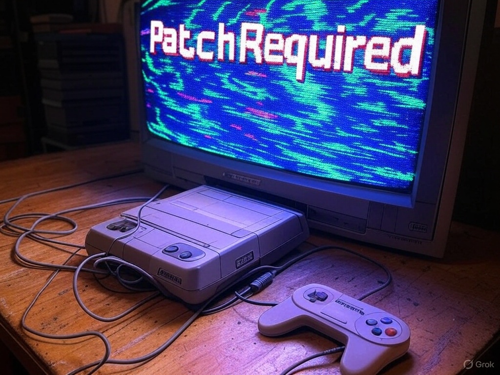
I’m no expert, but it seems to me that as video games grew more popular, profit-minded businesspeople got involved, and the internet’s ability to update games post-launch has created a situation where developers no longer release finished products. In older generations, game companies had in-house beta testers and couldn’t patch games after release—this meant games had to be ready and functional before they reached customers. These days, it’s almost the opposite: if you buy a game on launch day, you are the beta tester. For most of my life, if I bought a game, it worked on day one and didn’t suffer from performance issues (not always, of course—less reputable titles or cash-grab games based on TV shows or non-gaming IPs often carried risks). The Nintendo Seal of Approval actually meant something back then, but now I have trust issues (I’m looking at you, Pokémon Scarlet, a game that looks worse than its predecessors and had issues at launch). There are likely reasons for this shift in methodology, but I don’t think it’s in the customer’s best interest. Instead, it’s cheaper to release a somewhat functional product and fix it later—if it’s profitable to do so. If a bare-bones game flops, they can scrap updates and move on. There’s likely more to it, of course—I’m speaking as a customer, based on what it feels like from my end. But I don’t like it, and I don’t have to pay for this new development model. Neither do you.
I say it’s time to turn the tables on this practice of releasing half-baked games. First off, if you’re a gamer, you probably have a backlog of unfinished titles (I’m calling you out because you know it’s true). Second, if you wait until all the updates have rolled out for a game, you can buy it in a more complete, robust form. Think about it: if you wait a year after release, you’ll get a more polished, finished product—often at a sale price. You can enjoy a higher-quality, more valuable game for less money by working through your backlog and buying later. This lets you reclaim a perk of older gaming generations (who knew receiving a finished product would become a “perk”?)—getting a solid game the day you buy it. You can still game to your heart’s content while tackling your pile of shame. You’ll likely feel better about purchases you actually play and score a better deal on your next title. All it takes is a small shift in mentality. Let others beta-test your games with their day-one purchases—or, if enough people adopt this practice, developers might have to respond to market forces and rethink the system. Either way, you keep gaming at a far better value.
So, I ask you to consider this approach for yourself. It’s not always easy, but the rewards are real, and you might even dodge some real stinkers along the way. Sure, some folks might say, “But I love the hype of launch day!” Fair enough—but that’s mostly hot air if the launch sucks. A buggy mess or a half-baked game kills the vibe faster than you can say “patch incoming.” Why gamble on disappointment when you can wait, play your backlog, and snag a polished gem later?
Join the “Don’t Buy New Games” movement and help gamers take back a little control over our hobby, one backlog game at a time.
Thanks for reading,
Vince “AutomaticMonk” Davis
Formally Reflecting

Originally when I was assigned the task to compare presentation softwares PowerPoint and Prezi for the purpose of determining which was most suitable for technical writing students at Lane Community College I was given three criteria, of which two were to be selected as focus points for evaluation. The criterion choices available were “Ease of Use,” “Effectiveness for Audience Comprehension,” and “Creative Options.” This initial choice would prove to be its own small test in disguise. From my perspective as a technical writing student and my experience working in businesses I felt that “Ease of Use” was the primary category to focus upon- I don’t have time to waste so any time saved in the learning process can be redirected to more important things, such as building and practicing the presentation. Another litmus test I used to re-contextualize this primary choice was simple; I asked myself which criteria I would go with if I could only choose one and simulating the outcomes of the other choices was a simple exercise. Focusing on creative options would be beneficial to advanced users or artists perhaps but how could these options matter to a pressured person who needs to first learn how to use the software? Furthering this thought experiment I asked myself: “Would effectiveness for audience comprehension be the best solo criterion?” The same prioritization used in the 1st case applies here as well: Does it matter if the software is easier for the audience to receive if you can’t make a presentation in the first place due the time-consuming learning? Working from this functional framework it seemed clear to me that ease of use would have to be the primary factor here. The question thereafter was, which of the additional two criteria would best support the primary? This choice was a lot closer to call. One one hand I felt like effectiveness for audience comprehension would be the best choice since to be successful in the future, the presentations given by technical students should be comprehensible to the receiver. Fair point. The reason I selected creative options over audience comprehension instead is due to sequencing. Using the same functional framework mindset I reasoned that the reception of the audience is based on both the skill of the presenter overall and the fact that the presenter would best be able to craft such a presentation if given a wide range of options. In essence I see the criteria feeding and building off each other in this order: Foundationally ease of use unlocks the ability to use the software, creative options allow the skill of using the software to be transformed into building high quality and/or advanced presentations, and audience comprehension allows that presentation to deliver its content meaningfully. Each of them is needed for a presentation to exist and be successfully delivered.
To locate sources I performed two dedicated research phases in which I cast a wide net using two search engines, the database at PLOS One, and the Google Scholar service. These phases were not to necessarily evaluate sources, only to amass information for review. To put this into perspective, my original batch of sources consisted of about 30 studies and articles; By the time of the finalization of my report this number had been cut down to twelve. The goal was to collect any information regarding three targeted information categories: sources comparing PowerPoint to Prezi, sources comparing the features of PowerPoint, Prezi, or both, and sources providing information on what college students desired from their presentation software. After these gathering phases a filtration phase was performed to target the most relevant data and use it to make a recommendation.
The filtration of data was a two priority level system. Information was first filtered by category; Scientific studies and academic work were tier one, large data sets and expansive works citing sources in tier one were in tier two, and tier three consisted of anything else. Each subset was then prioritized by recency. This organization shaped how the gathered data was valued and allowed me to quickly discount low-quality or irrelevant sources, leaving behind potentially useful sources. Most of the cuts were due to the material being too dated or commercialized, but a couple of cuts were made due to quality issues. One cut, for example, was an article from Udemy.com that specifically compared PowerPoint to Prezi in good detail; The article was well written and did a decent job explaining what the softwares do but seemed to stress the point that it didn’t matter which you chose since presenter skill is the determining factor in how well a presentation is received. While I agree with this notion personally, Udemy is a business that generates its income from selling lessons to users so there is a profitable incentive for Udemy to talk about these two softwares without being too conclusive, while pushing users towards purchasing a lesson for whichever software they appeal to. Since concluding my inquiry I reread the Udemy article’s findings for the softwares and found them to be generic and dated compared to other sources that ended up in the report.
As a result of gathering and organizing the information it became clear that there were a couple serious issues that had risen to the surface in regards to the inquiry that would need to be addressed in order for me to make a true recommendation. On a positive note I had also found a well done current study and a potential databank to draw information from. The first issue I noticed was that there seemed to be a lack of current serious studies done on presentation software. The second issue was with my choice of criteria. As I looked through articles and studies regarding the features of each software a pattern emerged- articles would often tout one software over the other based on a particular functionality or feature, only to be nullified by a more recent article talking about how the features were updated. This was a more serious issue as one of my criteria “Creative Options” was going to be a detailed feature comparison between the two contenders and this factor kept constantly evolving! This was no good for making a determination! BLAST!
For the first issue, low supply of current information, I decided that the most recent and well performed study would be used as a primary source to draw from with additional context coming from older works. This primary source is a 2021 study published by the State University of New York Institute of Technology “Prezi v. PowerPoint: finding the right tool for the job.”
Additionally, a software review website I discovered, G2.com, had thousands of confirmed user reviews (growing by the day) for PowerPoint and Prezi that were broken down into nine categories related to ease of use, many specific feature ratings, and data on the organization sizes the user review came from. This dataset of user reviews was much larger than any study’s test groups by a large margin so I placed the “Ease of Use” ratings for each software into excel sheets to build graphs for analysis. While G2.com is a software retailer, the reviews are user generated and require you to sign up and give detailed information to confirm your G2.com account so I felt like the commercial aspect of the site was disconnected from the data and was not likely to compromise it. More than anything else, this was the largest set of data available on PowerPoint or Prezi that I could locate and that was unique, exciting, and valuable, to the comparison in my eyes.
To deal with the second issue I was going to have to change gears and refocus on “Effectiveness for Audience Comprehension” over “Creative Options,” which struck a blow to my schedule more than anything else as I had to go over my sources again to see if there was any information in them that related to comprehension. Fortunately, my primary source study (chosen for its feature analysis and comparisons) also boasted a hearty section on a design philosophy called Human Centered Design (HCD) which provides standards for creating products as user friendly as possible (as opposed to task friendly). The HCD portion of the study examined how well an audience received information from PowerPoint, Prezi, and an oratory presentation. The data was broken into four HCD categories “coherence,” “engagement,” “inclusiveness,” and “malleability” and a post experiment survey was included with data on the number and ratings each software received. I had my pivot for my secondary criteria, a strong set of data for the first criteria, but it still felt like something was missing.
Unfortunately I couldn’t generate or find more data that was current so I turned to some of my other sources to compare them to the primary ones to give them context. While opinion articles weren’t valuable as primary sources, they were useful in “checking” the primary sources. The recent articles about Prezi as well as the dated ones seemed to confirm Prezi’s ease of use issues found in my primary study. However, an older study by Harvard (the first major study comparing PowerPoint and Prezi) seemed to contradict the findings in my primary source on the subject of effectiveness of audience use. This could be explained by many factors and required a closer look. Upon deeper investigation, it was found that differences between the software were very close; Additionally, annotations to the study were discovered that indicated a conflict of interest disclosure that had been originally left out when the study was published but added months later: Prezi was the funding source for the study. This alone didn’t discount the study but it also didn’t reinforce my confidence in it. I decided to include the Harvard study to provide additional context to balance the report findings. More interestingly and more importantly, the Harvard study contained a second note:
“As of the latest report Prezi still does not meet the accessibility standards of either the Americans with Disabilities Act or WCAG. Unless and until this is addressed other formats will be needed for viewers with sight and other disabilities. Doug Gray, communications specialist, Special Education Division, Minnesota Department of Education.”
This opened a new channel to examine in regards to making a recommendation. Looking into Prezi via the previously mentioned research tools, no indication was found that Prezi met the compliance standards of the Americans with Disabilities Act (ADA), and while there was one indication that Prezi was compatible with WCAG (Web Content Accessibility Guidelines) but it was the outdated WCAG 2.0 standard and not the current WCAG 3.0. Looking into PowerPoint revealed that not only was PowerPoint ADA compliant, the software also included a feature that checks the user’s presentation to ensure that the presentation itself is ADA compatible. This information was key in pushing the recommendation towards PowerPoint since I could not conceivably recommend a software to an educator that might be exclusive to impaired students.
The recent studies supported PowerPoint over Prezi conclusively in the category of ease of use. Effectiveness of audience comprehension was a much closer slice, while PowerPoint came out on top, it was razor thin and historically a toss-up.
Looking back on the research overall, I feel like my process was effective in delivering a timely recommendation given a limited pool of studies to work with. The gathering and data filtration methods I used saved me a ton of time while providing a large enough pool of resources to pull from. That being said I wish I had more time to put into fleshing out the data even more and delving further into the concepts behind human centered design and what the best potential presentation software might look like. If I were to do this project again I would give myself more time to define and contextualize the data further; Due to time pressure I ended up using the studies’ definitions for certain concepts, and while that’s fine I would have liked to spend more time examining them from a second (or third or fourth) reputable source. Secondly, you can never have enough information for an inquiry- I like to say it’s always better to have too much than not enough of a good thing and this is especially true for any research endeavor. There is such a thing as enough data but it is much easier to cut down a dataset to “enough” than to build one up later on when you realize you need more, which nearly happened to me in this case. Lastly, I would suggest that you write reports and revise them on different days if possible. Everytime I think a report is complete I give it a day and revise again, and every single time I find mistakes or better ways to formulate my work, regardless of how perfect I felt it was the day before.
For those interested in the report itself, you can view it by clicking here.
Thanks for reading,
-Vince
POWERPOINT FREQUENTLY ASKED QUESTIONS (FAQ)
What is PowerPoint?
PowerPoint is a presentation software (a program used to assemble and present slides of visual information on a computer) using a familiar windowed interface that allows users to create and order slides to be presented. PowerPoint has options to add drawings, various types of visual or audio media, text, animations, and comes with online file storage and compatibility with Microsoft’s Office Suite applications.
Where did PowerPoint come from and why is it so widely used?
PowerPoint was originally dubbed “Presenter” before being acquired by Microsoft and rebranded as PowerPoint in 1990; Richard Gaskins, a computer scientist, developed Presenter to remove tedium from the preparation of visual slide presentations. Before PowerPoint existed, presentations were done using spreadsheets, chalkboards, and transparencies, all of which were either time consuming to make, unintuitive at communicating information, or both. Due to PowerPoint being the first presentation software made accessible, it has become a common name in education and business, dominating the marketplace. A 2012 study which surveyed over a thousand presenters who were either students or employees from varying fields found that 83% of the participants named PowerPoint as the software they used for presentations with no competing software garnering higher than 4% (Thielsch, M. T. & Perabo, I. 2012). Since 2012 new competitors like “Prezi” have hit the market offering alternatives. PowerPoint isn’t just a presentation software, it’s a virtual studio and the original magic rectangle on a computer screen that brought humanity out of the age of projectors and chalkboards (Sen, 2018).
How do I use PowerPoint and which operating systems run it?
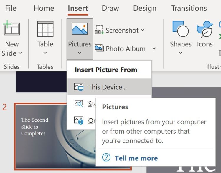
PowerPoint is available on Windows, Apple, IOS, and Android so you will require a machine running on one of these operating systems in order to use it. The program’s interface is a window with a feature bar (called a tool or command bar) across the top with options to create new slides or add features to existing ones. New slides can be added by right clicking and selecting from a drop down menu (see Figure 1 below). Media of many kinds can be inserted and the program comes with a healthy supply of free stock images to use as well. A design suggestion feature (under designs>design ideas) will preview potential slide builds which you can choose to template from and will assist in building a professional presentation quickly.
Figure 1: Creating a new slide via dropdown menu in the PowerPoint interface.

Is PowerPoint hard to use? Where can I learn more?
For users that are familiar with windows, using PowerPoint should be intuitive, but for other users it might not be. Fortunately, if you stop the mouse cursor over a toolbar feature PowerPoint will display a detailed description of it and an option to click to learn more, as visible in Figure 2 (below). Control Z works like other Windows programs, undoing the last change that was made and right clicking will produce a dropdown menu with more options. The depth of features may feel intimidating but for a new user the basic elements are accessible and presentations can be made without having to do much leg work. If you can right click, drag, drop, and navigate a toolbar, then you can make a presentation in PowerPoint. If you would like to learn more about how to use PowerPoint, a decent guide is available from 24slides.com. From my personal experience, going into PowerPoint and testing out the features has been fruitful and fun.
Figure 2: Inserting a picture using the toolbar in the PowerPoint Interface.
Is PowerPoint good for creating video presentations?
Yes and no; PowerPoint lacks the deep features that a dedicated video editor has but can do light recording and transition work. Overall PowerPoint is a platform for integrating media in an orderly way. It can be used to place a video into a presentation but would be cumbersome if used purely as a video editor; You could use it as one but you’d likely be better off using an actual video editor to do the patchwork, then inserting the polished video into a PowerPoint slide for presentation. PowerPoint is not a content generator (though it can emulate one), it is an option laden vehicle for your content to reach the audience. You must drive and stock the vehicle but it will get your cargo from A to B.
How do you present using Powerpoint?
If you are presenting from your PC, notebook, or tablet you can use PowerPoint to run the slideshow on screen or a designated monitor. Another option for presentation is to share your screen in Zoom while in slideshow mode (Zoom 2021.)
You can download a sample presentation I made while preparing this FAQ this link:
References
Carla Albinagorta (2020). PowerPoint 101: The ultimate tutorial for beginners. 24 Slides.
24slides.com/presentbetter/powerpoint-101-the-ultimate-tutorial-for-beginners/
Sen, Priyanka. (2018). Disruption, innovation, and endurance: A brief history of PowerPoint.
Hult International Business School.
www.hult.edu/blog/brief-history-of-powerpoint
Thielsch, M. T. & Perabo, I. (2012). Use and evaluation of presentation software. Technical
Communication, 59(2), 112-123.
Zoom. (2021). Screen sharing a PowerPoint presentation.
support.zoom.us/hc/en-us/articles/203395347-Screen-Sharing-a-PowerPoint-
Starting out Solid

This week I started learning how to model in Solidworks (a powerful engineering CAD software) and it has been really fun! To begin I’ve just been modeling parts from 2D schematics but I’m excited to draw and model some designs of my own once I’m proficient. In Solidworks you can model with a ton of real world materials from metals and glass to carbon fiber and wood; I find it particularly entertaining to take my parts and turn them into wood and other stuff just to see what it would be like.
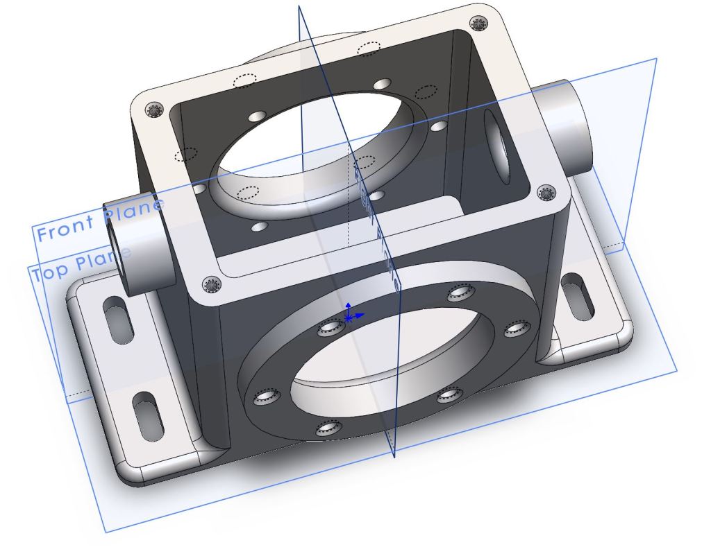
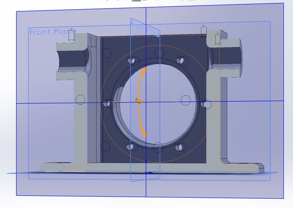
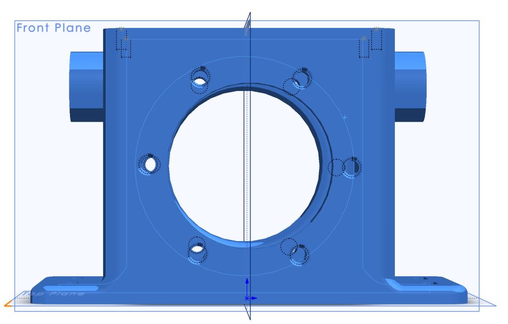
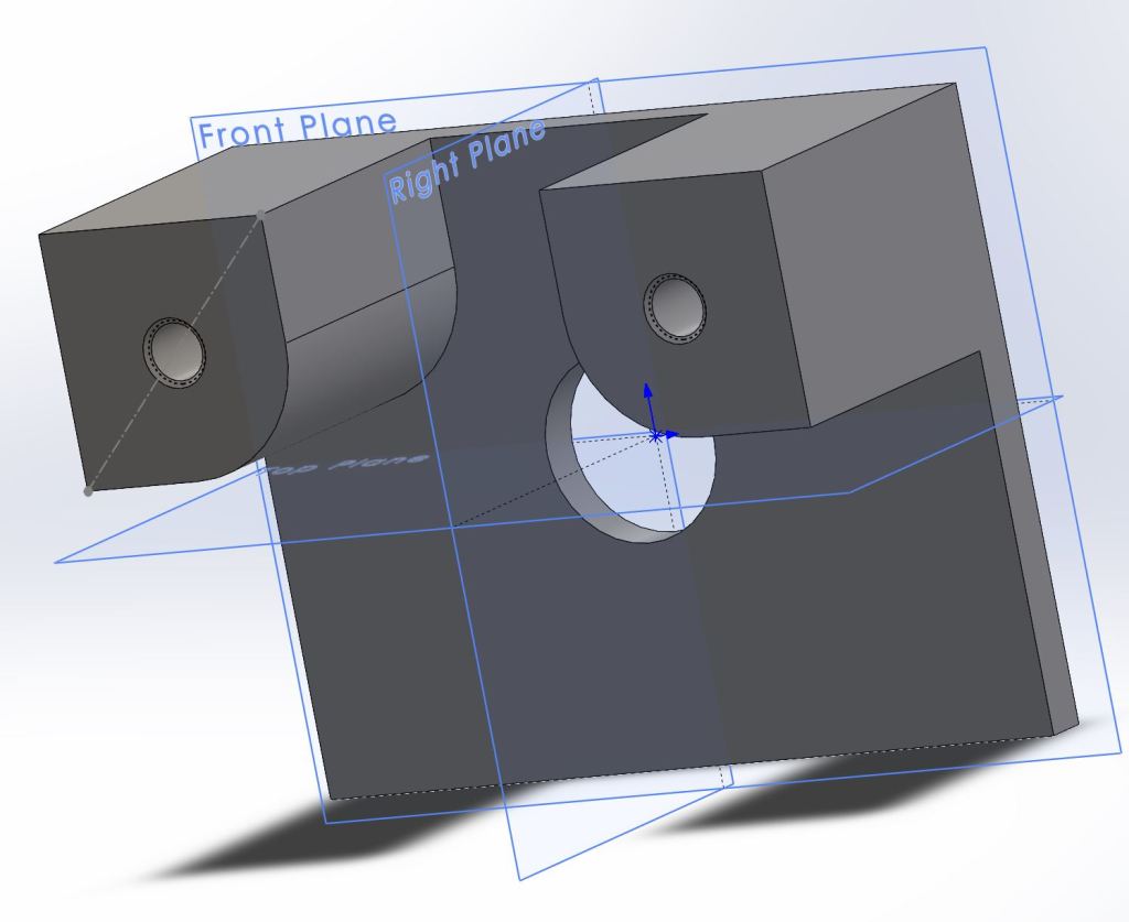
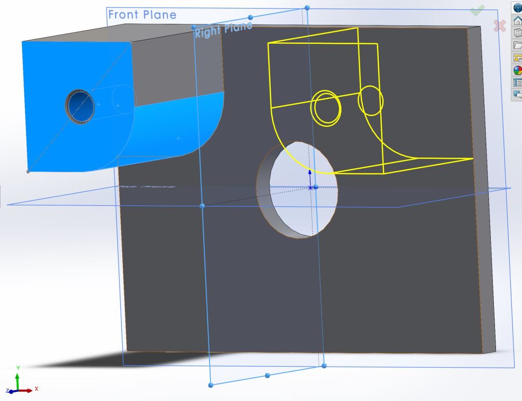
This is my first model, a gearbox housing:

Bisectional
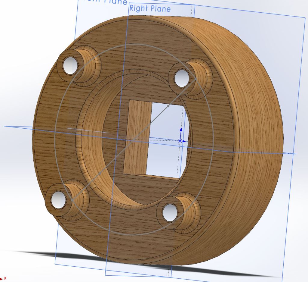
I couldn’t resist adding a sweet metallic blue paint coat:

Bisectional 
This model took about three hours to complete using specified techniques to do each feature. The next two parts I was free to model as I saw fit and it took about a half hour per part, though they were less involved. Overall, getting into Solidworks has felt pretty easy as long as I remember to exit the sketch screen and to use escape whenever I initiate something I didn’t intend to.
Here is my second model, as you can see it is much simpler.
Preview of mirroring a feature
My third model was much more fun to develop:

Early Rendition 
Final Model

So far I’ve really enjoyed working with Solidworks in the short time I have been using it. The tutorial was long but worth doing every step. I look forward to learning the 2d schematics, assembly features, and simulation tools as I progress in the term. The biggest challenge is just making sure I have good and consistent practices while I model. I tend to save often, a habit gained from overconsumption of video games that is serving me well. In the future I will post more of my models if you are interested to see more solid work.
Thanks for reading,
-Vince
BONUS CONTENT:
Teak Wood 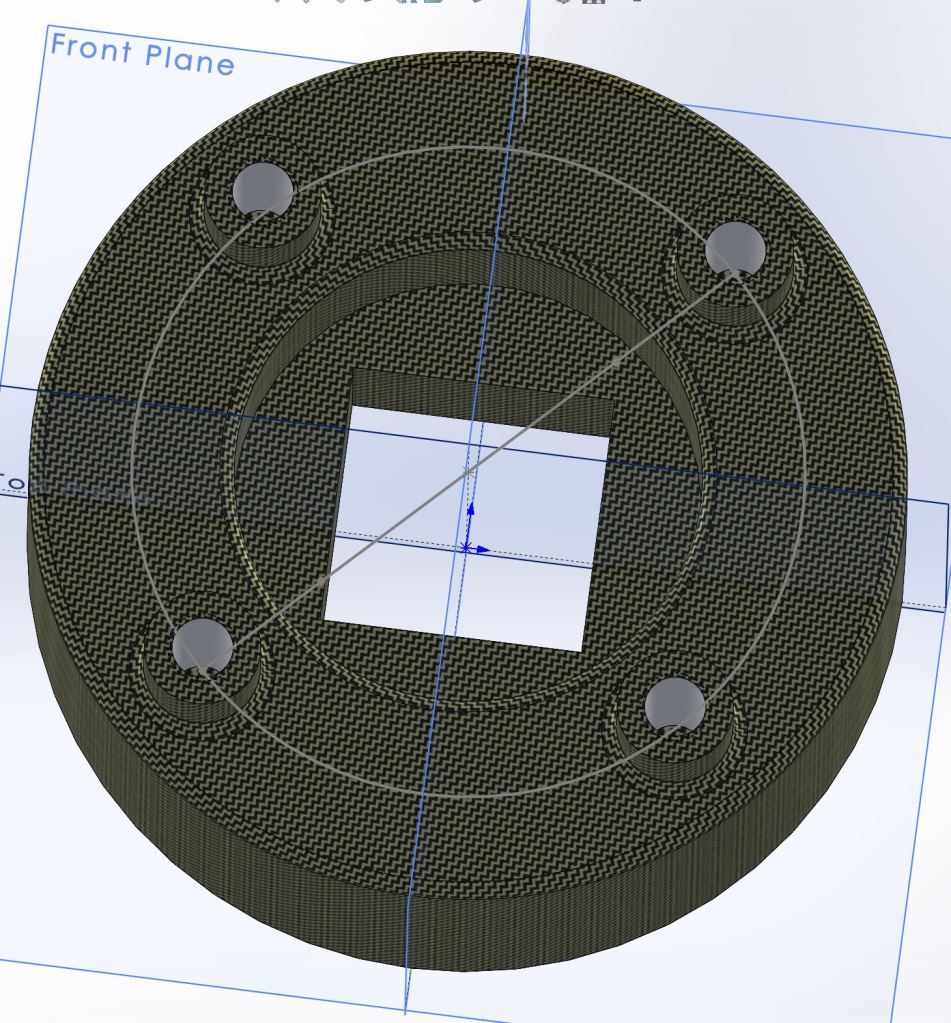
Carbon Cloth
Cannabis Report 3/24/21

The Road So Far
It has been two weeks since I began germinating cannabis seeds. Of the large amount of seeds germinated, only five opened and only three of them are thriving. Luckily those three have shown incredible growth and seem truly hungry for life.
It is my thoughts that the low germination rate is due to multiple factors:
- I have no idea what the age of the seeds is.
- I screwed up one night and didn’t water the seeds because I thought they would still be damp; I found one seed portion dry in the morning- luckily the rest were still wet.
- Many growers germinate with a nutrient substrate and I did not.
- I don’t know the optimal temperature for germination.
Due to the low germination rate of the current process I postponed starting any new seeds. The current process is a basic wetted paper towel-sandwich contained between two plastic trays to block light and insulate the seeds. There is an alternative germination process which uses a 24 hour immersion phase prior to placing the seeds in their paper towels- I will try this on a small batch on non-premium seeds to see if I can get any results before I risk any rare ones. This weekend should be a good opportunity to get it set up.
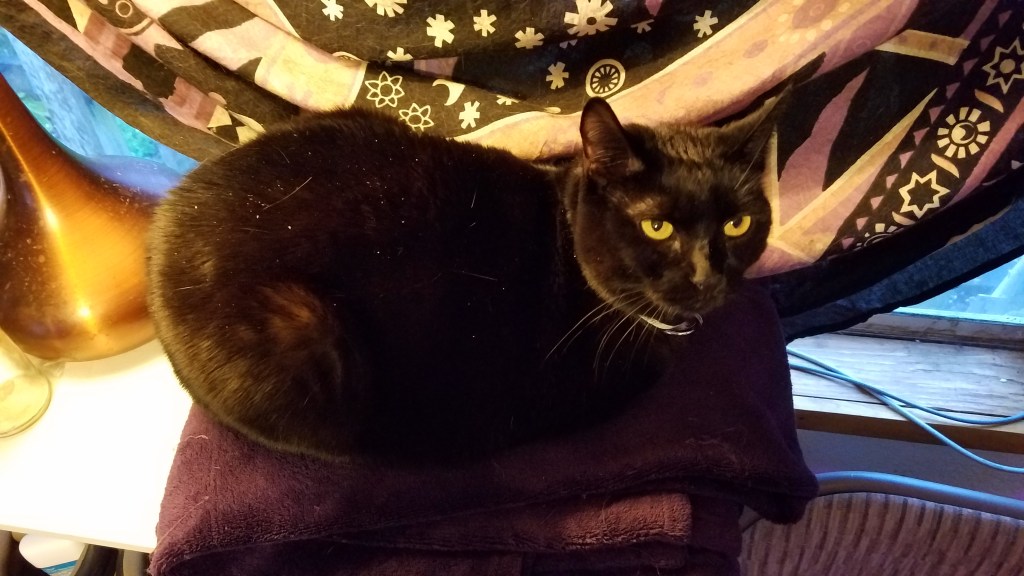
Additional Update: The cat likes to try and attack the plants so a cover has been added for security.


The Babies
The three successful seedlings are two White Runtz and one Black Truffle; Both rare and potent strains. Black Truffle is known especially for its extreme growth and it is fitting that while Black Truffle was the smallest starter, it has surpassed both of the White Runtz in size. All three have grown their first iconic “finger” leaves and have the second set growing in. Interestingly the cannabis leaves always have an odd number of fingers starting with one, then growing leaves with three, five, and so on, usually maxing out at nine.
The current set up for the babies is a stainless steel table with a radiator heater underneath to keep them safe from the cold mornings/evenings; Once the sun comes out I place the tray inside the dash of my truck to simulate a greenhouse. On dreary days, which are getting more rare as we move towards Summer, the seedlings enjoy a nice LED grow light that attaches to the steel table. This small set up has been working well but once the seedlings are large enough to transplant they will require more energy than these small lights give. Starting the seedlings early means they can start their vegetative progress as soon as the days are long and nice, giving them a great head start on the season.
One Week from Germination

Two Weeks from Germination

BIG TRUFF

THE ENEMY
Thanks for reading,
-Vince
Empire of the Clouds

R101 was an experimental airship built by the British Empire’s Air Ministry alongside and in direct competition to the development of the R100. The British government effectively organized an engineering competition between the Air Ministry and the private company Vickers (who developed tanks and automobiles used by the military) via their subsidiary Airship Guarantee Company. At the time that the R101 was constructed it was the largest aircraft to ever exist, coming in at 223 meters in length, and it would hold this record for seven years until the Hindenburg was created. Because R101 was built by the government using limited resources and the R100 was created by a private company who could spend as they pleased the twin dirigibles garnered the nicknames “Socialist Airship” for R101 and the “Capitalist Airship” for R100. The director of design for the R101 was Lieutenant-Colonel Vincent Crane Richmond Royal Airman and Engineer. Due to a previous engineering disaster involving an airship called the R38, diesel engines were chosen over petrol because the low flash point of petrol caused the explosion that destroyed the R38 while it traveling through the warmer climate of India. The R101 had many successful test flights and was being improved as new problems arose; The weight of the engines was an issue, structural damage from gas bag migration, and tears in the cover were all problems faced by the engineering team.
Left: Lieutenant-Colonel Vincent Crane Richmond | Right: Lord Thomson

On the evening of October 4, 1930, R101 departed from Cardington with the intent to fly to Karachi (the Indian portion of the British Empire at the time). A faulty engine gauge caused an engine to go down for maintenance but the ship was on its way. Bad weather led to a change in course to avoid North France which ironically put the airship on a route known to have turbulent winds. At 2 a.m. on October 5th, in the skies near Allonne France, R101 was flying low around 1000 feet above ground. At 2:07 R101 took a sudden 450 foot nose dive from which it slowly recovered from, tossing the crew and awakening any dormant members. The emergency ballasts were immediately deployed to try and stabilize the ship. The ship took a second nose dive regardless and as the call went over the radio to stall the engines the engineers had no time to respond because R101 had hit the ground and the hydrogen filled dirigible immediately caught fire, leading to a massive explosion. Of the 54 people aboard R101, 46 died upon impact and 2 more in the hospital later. The designer of the airship Lieutenant-Colonel Vincent Crane Richmond and the Secretary of State Lord Thomson were among the many engineers, statespeople, and military representatives who died in the crash.
The Mass Burial of the 48 Victims of the R101 Incident

In an investigation following the disaster it was determined that a tear had developed in the forward cover of the R101 which had caused the sudden catastrophic crash. Additionally, the crew had poor visibility and were relying on an altimeter to determine their flying altitude, which, due to a difference in regional atmospheric pressure, caused the crew to believe they were flying higher than they actually were, leaving them less space to react to the event before crashing. While other hydrogen gas dirigibles had crashed without burning, R101 ignited and exploded immediately leading the investigation team to believe that electrostatic discharge or a fire in an engine car caused the ignition rather than the diesel engines. The inquiry also stated that it was impossible to avoid the conclusion that the flight would not have been attempted if there were not excess pressure to impress the public. The R101 catastrophe effectively ended British interest in the development of dirigibles. The R100 was grounded and eventually scrapped despite having great test flights.
I learned about this disaster when I came across the tribute song “Empire of the Clouds” by Iron Maiden. I never thought I would like an 18+ minute long song but I was wrong; The video with lyrics are below if you’re interested to check it out.
-Vince
